
Question: How do maps influence our perspective of countries and continents?
Question: How do maps influence our perspective of countries and continents?
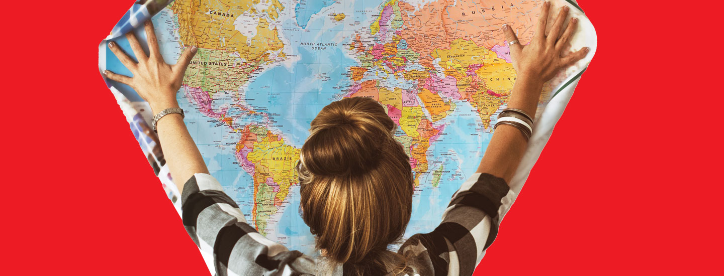
Emilija Manevska/Getty Images (person); Shutterstock.com (atlas)
STANDARDS
NCSS: People, Places, and Environments • Power, Authority, and Governance • Global Connections
Common Core: RH.6-8.1, RH.6-8.2, RH.6-8.4, RH.6-8.7, WHST.6-8.4, RI.6-8.1, RI.6-8.2, RI.6-8.4, RI.6-8.7, W.6-8.4
GEOGRAPHY
A New View of Africa
A global campaign is pushing for a map that shows the continent’s true size. Will the world listen?
Question: How do maps influence our perspective of countries and continents?
Question: How do maps influence our perspective of countries and continents?
Pop quiz! What’s bigger: Africa or Greenland? If you checked a map and found it hard to tell, you were probably looking at a Mercator projection. That type of world map is commonly used in schools, books, and online. On the Mercator map, Africa and Greenland look about the same size—though in reality, Africa is 14 times bigger. (The continent stretches 11.7 million square miles, while Greenland—a self-governing territory of Denmark—measures 836,330 square miles.)
Because Earth is a sphere, it’s impossible to create a flat world map that’s completely accurate. But a growing movement called #CorrectTheMap is pushing to replace the centuries-old Mercator projection. Organizers of the campaign support using a map called the Equal Earth projection instead. The Equal Earth map shows places much closer to their true size than the Mercator map does. However, it distorts the shape of countries to varying extents.
The African Union, a group representing all the nations in Africa, recently announced its support for the campaign. African Union officials say the switch is about more than just accuracy. It’s about changing perceptions. No matter where we’re from, they point out, the maps we use have implications for how we think about the world—and the people in it.
Pop quiz! What’s bigger: Africa or Greenland? Did you check a map and find it hard to tell? If so, you were probably looking at a Mercator projection. That type of world map is commonly used in schools, books, and online. On the Mercator map, Africa and Greenland look about the same size. But in reality, Africa is 14 times bigger. (The continent stretches 11.7 million square miles. But Greenland measures 836,330 square miles. It is a self-governing territory of Denmark.)
Earth is a sphere. So it is impossible to create a flat world map that is completely accurate. But a growing movement called #CorrectTheMap is pushing to replace the centuries-old Mercator projection. Organizers of the campaign support using a map called the Equal Earth projection instead. The Equal Earth map shows places much closer to their true size than the Mercator map does. But it distorts the shape of countries to varying extents.
The African Union is a group representing all the nations in Africa. It recently announced its support for the campaign. African Union officials say the switch is about more than just accuracy. It is about changing perceptions. They say that no matter where we are from, the maps we use affect how we think about the world—and the people in it.
“Maps shape how we compare and think about different regions.”
—Jack Swab, geographer
Mercator’s Beginning
Gerardus Mercator, a European mapmaker, created his projection in 1569. At the time, navigating by sea was complicated and inexact—sailors often relied on compasses, stars, and ocean currents as guides. Mercator wanted to make traveling the oceans easier.
Even back then, maps used a system of imaginary intersecting lines, called latitude and longitude. These lines form a grid that can be used to pinpoint any place on Earth. Many maps of the day featured curved lines of longitude, like those found on a globe. Mercator’s projection was a game changer because it features straight lines of latitude and longitude that intersect at 90-degree angles. This let sailors plot direct routes more easily.
“You could identify on the map a place of origin and a destination and draw a straight line between the two,” explains Mark Monmonier, a geographer and author.
But in order to present lines of latitude and longitude as a perfect grid, the Mercator map has to stretch and shrink parts of the world. As a result, landmasses near the equator, like Africa and South America, appear much smaller than they really are. And places near the North and South poles, such as Greenland and Antarctica, look much larger.
Gerardus Mercator was a European mapmaker. He created his projection in 1569. At the time, navigating by sea was complicated and inexact. Sailors often relied on compasses, stars, and ocean currents as guides. Mercator wanted to make traveling the oceans easier.
Even back then, maps used a system of imaginary intersecting lines, called latitude and longitude. These lines form a grid that can be used to pinpoint any place on Earth. Many maps of the day featured curved lines of longitude. That is like those found on a globe. Mercator’s projection was a game changer. It features straight lines of latitude and longitude that intersect at 90-degree angles. This let sailors plot direct routes more easily.
“You could identify on the map a place of origin and a destination and draw a straight line between the two,” explains Mark Monmonier. He is a geographer and author.
But there was a challenge with presenting lines of latitude and longitude as a perfect grid. The Mercator map has to stretch and shrink parts of the world. As a result, landmasses near the equator appear much smaller than they really are. That includes Africa and South America. And places near the North and South poles look much larger. That includes Greenland and Antarctica.
Shaping Perceptions
Today maps are used for more than navigating the seas. They help people visualize the entire world, including how countries appear in relation to each other. That gives maps power, says Jack Swab, a University of Tennessee geographer. “Maps shape how we compare and think about different regions,” he says.
Organizers of the #CorrectTheMap campaign argue that if maps show Africa looking smaller than other continents, people might infer that it’s less important. “In a world where size is often equated with power, misrepresenting Africa’s true scale reinforces harmful misconceptions about its . . . significance,” they state.
Today maps are used for more than navigating the seas. They help people visualize the entire world. That includes how countries appear in relation to each other. That gives maps power, says Jack Swab. He is a University of Tennessee geographer. “Maps shape how we compare and think about different regions,” he says.
Organizers of the #CorrectTheMap campaign argue that it is problematic for maps to show Africa looking smaller than other continents. People might infer that it is less important. “In a world where size is often equated with power, misrepresenting Africa’s true scale reinforces harmful misconceptions about its . . . significance,” they state.
A Better Balance?
The campaign is calling for the United Nations and the global community to embrace the Equal Earth map. So far, #CorrectTheMap has amassed more than 9,100 signatures. Now that the African Union has offered its support, more international groups and governments might follow.
But actually making the switch would require a major global effort. Countless countries, books, websites, and organizations use Mercator-style projections.
Plus, some geographers point out, no flat map of a round world will ever be perfect. Still, Monmonier says, the Equal Earth projection is “a pretty good one.”
The campaign is calling for the United Nations and the global community to embrace the Equal Earth map. So far, #CorrectTheMap has more than 9,100 signatures. And now the African Union has offered its support. So more international groups and governments might follow.
But actually making the switch would require a major global effort. Countless countries, books, websites, and organizations use Mercator-style projections.
Plus, no flat map of a round world will ever be perfect. Some geographers point that out. Still, Monmonier says, the Equal Earth projection is “a pretty good one.
YOUR TURN
Compare and Contrast
Study the Mercator and Equal Earth projections above. Then list at least two ways they are similar and two ways they are different.
Study the Mercator and Equal Earth projections above. Then list at least two ways they are similar and two ways they are different.
Want to dig deeper? Click here to explore our atlas and almanac.
Want to dig deeper? Click here to explore our atlas and almanac.